Friday, July 27, 2012

How to Customize the look and feel of WPF Tree view? [Part 2]

Styling the expend collapse icon

This part is not easy, we have to open the box and see for our self what’s inside? fear not!! we can open its internal structure using expression blend and then modify the required stuff, our goal in this section is to replace the default expand collapse icon with something more friendly, for instance a plus and minus icon would do for now I guess.
Lets open the project in expression blend navigate to our desired project and then open the desired window, in our case we have main window, a simple tree view control is added. navigate to the tree view just like the image shown here, then select one of the TreeViewItem , if there is no add a demo one. Then right click and select edit template, and select edit a copy.
TreeViewTemplate_thumb2
It will quickly extend the style and bring out the desired styles in a resource file. if you mention it. well here is the xaml looks like after I have edited the default template.
image_thumb5
Looks rusty! but you have to consider that I am a developer not a designer, designers will come out with awesome design to look it good. well our main concern is the know now. Bello I have listed the complete xaml for the edited TreeViewItem Template.
<ResourceDictionary xmlns="http://schemas.microsoft.com/winfx/2006/xaml/presentation"
                    xmlns:x="http://schemas.microsoft.com/winfx/2006/xaml">
    <Canvas x:Key="FolderIcon" x:Shared="false" Width="16" Height="16" ClipToBounds="True">
        <Rectangle Fill="BlanchedAlmond" Canvas.Left="0" Canvas.Top="0" Height="15" Width="15">
        </Rectangle>
    </Canvas>
    <Style x:Key="TreeViewItemFocusVisual">
        <Setter Property="Control.Template">
            <Setter.Value>
                <ControlTemplate>
                    <Rectangle/>
                </ControlTemplate>
            </Setter.Value>
        </Setter>
    </Style>
    <PathGeometry x:Key="TreeArrow" Figures="M0,0 L0,6 L6,0 z"/>
    <Style x:Key="ExpandCollapseToggleStyle" TargetType="{x:Type ToggleButton}">
        <Setter Property="Focusable" Value="False"/>
        <Setter Property="Width" Value="16"/>
        <Setter Property="Height" Value="16"/>
        <Setter Property="Template">
            <Setter.Value>
                <ControlTemplate TargetType="{x:Type ToggleButton}">
                    <Border Height="16" Width="16" BorderBrush="Gray" BorderThickness="1" Background="Transparent">
                        <Canvas Name="ExpandPath">
                            <Rectangle x:Name="virticalbar" Canvas.Top="1" Canvas.Left="6.5" Width="1" Height="12" Fill="Gray"></Rectangle>
                            <Rectangle Canvas.Left="1" Canvas.Top="7" Width="12" Height="1" Fill="Gray"></Rectangle>
                        </Canvas>
                    </Border>
                    <ControlTemplate.Triggers>
                        <Trigger Property="IsMouseOver" Value="True">
                        </Trigger>
                        <Trigger Property="IsChecked" Value="True">
                            <Setter Property="Visibility" TargetName="virticalbar" Value="Hidden"></Setter>
                        </Trigger>
                    </ControlTemplate.Triggers>
                </ControlTemplate>
            </Setter.Value>
        </Setter>
    </Style>
    <Style TargetType="{x:Type TreeViewItem}">
        <Setter Property="Background" Value="Transparent"/>
        <Setter Property="HorizontalContentAlignment" Value="{Binding HorizontalContentAlignment, RelativeSource={RelativeSource AncestorType={x:Type ItemsControl}}}"/>
        <Setter Property="VerticalContentAlignment" Value="{Binding VerticalContentAlignment, RelativeSource={RelativeSource AncestorType={x:Type ItemsControl}}}"/>
        <Setter Property="Padding" Value="1,0,0,0"/>
        <Setter Property="Foreground" Value="{DynamicResource {x:Static SystemColors.ControlTextBrushKey}}"/>
        <Setter Property="FocusVisualStyle" Value="{StaticResource TreeViewItemFocusVisual}"/>
        <Setter Property="Template">
            <Setter.Value>
                <ControlTemplate TargetType="{x:Type TreeViewItem}">
                    <Grid>
                        <Grid.ColumnDefinitions>
                            <ColumnDefinition MinWidth="19" Width="Auto"/>
                            <ColumnDefinition Width="Auto"/>
                            <ColumnDefinition Width="*"/>
                        </Grid.ColumnDefinitions>
                        <Grid.RowDefinitions>
                            <RowDefinition Height="Auto"/>
                            <RowDefinition/>
                        </Grid.RowDefinitions>
                        <ToggleButton x:Name="Expander" ClickMode="Press" IsChecked="{Binding IsExpanded, RelativeSource={RelativeSource TemplatedParent}}" Style="{StaticResource ExpandCollapseToggleStyle}"/>
                        <Border x:Name="Bd" BorderBrush="{TemplateBinding BorderBrush}" BorderThickness="{TemplateBinding BorderThickness}" Background="{TemplateBinding Background}" Grid.Column="1" Padding="{TemplateBinding Padding}" SnapsToDevicePixels="true">
                            <ContentPresenter x:Name="PART_Header" ContentSource="Header" HorizontalAlignment="{TemplateBinding HorizontalContentAlignment}" SnapsToDevicePixels="{TemplateBinding SnapsToDevicePixels}" Margin="4,0,0,0"/>
                        </Border>
                        <ItemsPresenter x:Name="ItemsHost" Grid.ColumnSpan="2" Grid.Column="1" Grid.Row="1"/>
                    </Grid>
                    <ControlTemplate.Triggers>
                        <Trigger Property="IsExpanded" Value="false">
                            <Setter Property="Visibility" TargetName="ItemsHost" Value="Collapsed"/>
                        </Trigger>
                        <Trigger Property="HasItems" Value="false">
                            <Setter Property="Visibility" TargetName="Expander" Value="Hidden"/>
                        </Trigger>
                        <Trigger Property="IsSelected" Value="true">
                            <Setter Property="Background" TargetName="Bd" Value="{DynamicResource {x:Static SystemColors.HighlightBrushKey}}"/>
                            <Setter Property="Foreground" Value="{DynamicResource {x:Static SystemColors.HighlightTextBrushKey}}"/>
                        </Trigger>
                        <MultiTrigger>
                            <MultiTrigger.Conditions>
                                <Condition Property="IsSelected" Value="true"/>
                                <Condition Property="IsSelectionActive" Value="false"/>
                            </MultiTrigger.Conditions>
                            <Setter Property="Background" TargetName="Bd" Value="{DynamicResource {x:Static SystemColors.ControlBrushKey}}"/>
                            <Setter Property="Foreground" Value="{DynamicResource {x:Static SystemColors.ControlTextBrushKey}}"/>
                        </MultiTrigger>
                        <Trigger Property="IsEnabled" Value="false">
                            <Setter Property="Foreground" Value="{DynamicResource {x:Static SystemColors.GrayTextBrushKey}}"/>
                        </Trigger>
                    </ControlTemplate.Triggers>
                </ControlTemplate>
            </Setter.Value>
        </Setter>
        <Style.Triggers>
            <Trigger Property="VirtualizingStackPanel.IsVirtualizing" Value="true">
                <Setter Property="ItemsPanel">
                    <Setter.Value>
                        <ItemsPanelTemplate>
                            <VirtualizingStackPanel/>
                        </ItemsPanelTemplate>
                    </Setter.Value>
                </Setter>
            </Trigger>
        </Style.Triggers>
    </Style>  
</ResourceDictionary>


Style the selected item


Now its time to style the selected item, if you carefully notice that by default when you select any items in WPF tree view you would see that there is a blue background appear behind the selected item. There is a good chance that the client or users will not like it in customized business solutions. Again since we have the whole skeleton of the TreeViewItem we would simply modify the default style.

Bellow I have listed the xaml part of the above full style but with a simple modification in one line only, note that we have a trigger were IsSelected Property is been queried with value True, where we have changed the default value to our customized value “Silver”.

<ControlTemplate.Triggers>
    <Trigger Property="IsExpanded" Value="false">
        <Setter Property="Visibility" TargetName="ItemsHost" Value="Collapsed"/>
    </Trigger>
    <Trigger Property="HasItems" Value="false">
        <Setter Property="Visibility" TargetName="Expander" Value="Hidden"/>
    </Trigger>
    <Trigger Property="IsSelected" Value="true">
        <Setter Property="Background" TargetName="Bd" Value="Silver"/>
        <Setter Property="Foreground" Value="{DynamicResource {x:Static SystemColors.HighlightTextBrushKey}}"/>
    </Trigger>
    <MultiTrigger>
        <MultiTrigger.Conditions>
            <Condition Property="IsSelected" Value="true"/>
            <Condition Property="IsSelectionActive" Value="false"/>
        </MultiTrigger.Conditions>
        <Setter Property="Background" TargetName="Bd" Value="{DynamicResource {x:Static SystemColors.ControlBrushKey}}"/>
        <Setter Property="Foreground" Value="{DynamicResource {x:Static SystemColors.ControlTextBrushKey}}"/>
    </MultiTrigger>
    <Trigger Property="IsEnabled" Value="false">
        <Setter Property="Foreground" Value="{DynamicResource {x:Static SystemColors.GrayTextBrushKey}}"/>
    </Trigger>
</ControlTemplate.Triggers>


The result is given bellow

Customize outer looks


Most easy part may be customize the outer look we can achieve this with the basic WPF knowledge's. All the container property such as Border Brush, Border thickness and Margin or Padding is available for modification. One interesting this is modification of the scroll bars, in this particular scenario you might want to again expression blend to customize the look and feel of the scroll content and scroll viewer scrollbars.

Summery


In this short article we have seen that how we can customize WPF tree view for our own way and they way we want it to be look like. The methods that has been used in this article is not prefect but one of the solution that can be implemented. Hopefully in future we can look more into it and customize even more to achieve our desired look and feel. If your have any feed back and suggestion please feel free to add in the comment section.

References


Friday, July 20, 2012

How to customize the look and feel of WPF tree view? [part1]

Why we need to customize Tree view?

Intention is to modify default look and feel so that we can use the tree view as custom purpose control not just hierarchical data structure, a good example could be a folder explorer.

In this short article we are going to see how to customize tree view look and feel. first we will look at how to customize the style of a tree view item, then move on to the expand and collapse icon, and lastly we would see how to style a selected item.

image_thumb11_thumb2

Styling the items

Lets say we want to display a icon before each tree view “item node” so that the user knows what type of file item it is, right now we have drive, directory and file, so we would add thee resources to display. Bellow a simple code is given to demonstrate how to read a file system, and then populate in a dependency object so that it can be bind to a tree view.

[Sample c# code]

using System.Collections.Generic;
using System.IO;
using System.Windows;

namespace WPFFolderExplorer
{
public class FileSystemPresenter : DependencyObject
{
public FileSystemPresenter()
{
LoadFileSystem();
}

private void LoadFileSystem()
{
var liteDirectoryInfos = new List<LiteDirectoryInfo>();
var driveInfos = DriveInfo.GetDrives();
foreach (var driveInfo in driveInfos)
{
if (driveInfo.DriveType == DriveType.Fixed)
{
var liteDirectoryInfo = new LiteDirectoryInfo
{
FileName = driveInfo.Name,
FileType = FileType.Drive
};
var info = new DirectoryInfo(driveInfo.Name);
var directoryInfos = info.GetDirectories();
foreach (var directoryInfo in directoryInfos)
{
liteDirectoryInfo.Files.Add(new LiteDirectoryInfo
{ FileName = directoryInfo.Name,
FileType = FileType.Folder });
}
liteDirectoryInfos.Add(liteDirectoryInfo);
}
}
FileSystem = liteDirectoryInfos;
}

public List<LiteDirectoryInfo> FileSystem
{
get { return (List<LiteDirectoryInfo>)GetValue(FileSystemProperty); }
set { SetValue(FileSystemProperty, value); }
}

public static readonly DependencyProperty FileSystemProperty =
DependencyProperty.Register("FileSystem", typeof(List<LiteDirectoryInfo>),
typeof(FileSystemPresenter), new UIPropertyMetadata(null));
}

public class LiteDirectoryInfo
{
public LiteDirectoryInfo()
{
Files = new List<LiteDirectoryInfo>();
}
public string FileName { get; set; }
public FileType FileType { get; set; }
public List<LiteDirectoryInfo> Files { get; set; }
}

public enum FileType
{
Drive,
Folder,
File
}
}

In the above code we have a enum FileType for distinguishing the file type. And a composite LiteDirectoryInfo where we have populated the directory structure. Finally After construction we preserved the data on FileSystem dependency property.


[Sample c# code for view c# part]


namespace WPFFolderExplorer
{
public partial class MainWindow
{
public MainWindow()
{
InitializeComponent();
DataContext = new FileSystemPresenter();
}
}
}

Above code shows only the part where I have assigned our custom presenter to the WPFFolderExplorer’s DataContext to follow MVP Pattern (Model,View,Presenter) where model is our own local drives and file system.


[Sample code for XAML is Given here]


<Window x:Class="WPFFolderExplorer.MainWindow"
xmlns="http://schemas.microsoft.com/winfx/2006/xaml/presentation"
xmlns:x="http://schemas.microsoft.com/winfx/2006/xaml"
Title="MainWindow" Height="350" Width="525">
<Window.Resources>
<Style TargetType="{x:Type TreeViewItem}">
<Style.Triggers>
<Trigger Property="IsMouseOver" Value="True" >
<Setter Property="Background" Value="Gray"></Setter>
</Trigger>
</Style.Triggers>
</Style>
</Window.Resources>
<Grid>
<DockPanel LastChildFill="True">
<Border DockPanel.Dock="Top" Height="30">
<!--tool bar will go here-->
</Border>
<TreeView DockPanel.Dock="Left" MinWidth="200" ItemsSource="{Binding FileSystem}">
<TreeView.ItemTemplate>
<HierarchicalDataTemplate ItemsSource="{Binding Files}">
<Border x:Name="itemBorder">
<DockPanel Margin="2">
<ContentControl Content="{DynamicResource FolderIcon}" DockPanel.Dock="Left"/>
<TextBlock Text="{Binding FileName}"></TextBlock>
</DockPanel>
</Border>
</HierarchicalDataTemplate>
</TreeView.ItemTemplate>
</TreeView>
<ContentControl>
</ContentControl>
</DockPanel>
</Grid>
</Window>

In above xaml code its shown that how the binding with the presenter dependency is done. Also note that the item template is defined for a tree view.

Friday, July 13, 2012

How to resolve the certificate problem of CruiseControl.net?

Hi today I am going to share a small tips, its about CruiseControl.net, I am sure every one have a clear idea about CruiseControl.net it’s a dot net distribution of famous continuous instigation software. Lets get back to the original context.

Get from SVN manually once

While creating project configuration if you ever encounter certificate error, here is how you can resolve this, first of all you have to login with a user name and password with admin privilege, and download the source of your desired project manually, while downloading the code you would be prompt with the certificate acceptance, please select accept permanently. 

Set service credential

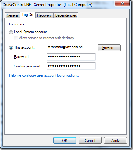
Great next step is to configure the service so that use “CruiseControl.NET Server” uses your logged in user’s credential. To do this open services from administrator tools, and located Cruise Control.NET Server and open the service, in Log on Tab click on Radio Button that says This account then add the user information and password. click Ok,

image 

When you click on Apply it would just give you a warning message, just click ok to proceed. After that run the build configuration again, you would see that the source control task of build configuration will able to get the source this time.

Hope this helps, until next time me signing out. 

References

http://multitiered.wordpress.com/2010/07/23/configuring-cruisecontrol-net-svn-visual-studio-2008-and-msbuild/

Friday, July 6, 2012

Using SQLite in Visual Studio 2010, with new and improved provider part2

Introduction

In previous post I have shown how to add a data connection in server explorer for a SQLite database file, and along the way also showed the process to create a new SQLite database file using visual studio 2010. if you haven’t read it or wish to read it please visit http://munnaondotnet.blogspot.com/2012/06/using-sqlite-in-visual-studio-2010-with.html farther more you can visit http://munnaondotnet.blogspot.com/search/label/SQLite for other SQLite post.

In this post we are going to discuss about few basics about SQLite designer in Visual Studio 2010, we have already see some basics of how to create table and view in previous post in this post we would look some of the related staff.

The designer tools

All the tool related to the SQLite designer is accessible from the Visual studio toolbar when you select data table or any database object. Note that the tool specific for each purpose is context sensitive, so upon selecting right object the tool button will get enabled.

image

After creating the table first thing we want to do is to create a primary key from for the table, hopefully we have id column for our tables, to do this we can select the column the either click on the tool bar or right click and select set primary key from context menu. Pretty simple.

image

You can also see the generated script if in case you needed it, for this you have to select the table then select generate change script from context menu. Bellow I have given a screen show which shows the table “user”’s generated script in a dialog window.

image

To setup unique ness you have to set it from the table designer properties, which is situated down the table designer column editor. Bellow a screenshot is shown for this purpose.

image

setting up auto increment column for primary key

In this section we would see how to setup a primary key which is auto increment or identity column. To do this simply click on index editor from context menu or tool menu. You would see a screen dialog named Index Editor, where you have the option to set up Constrains, The top most is “Auto Increment”.   

image

However if you have data type other than “Integer” for your table primary key you would end up with the above error message, work around is simple and straight change the  primary key column to integer and then set auto increment to true and finally save.

image

Retrieving the data

Most easy part, just right click on the table and the select Retrieve data, note that you can also use this to insert data in design view, there is a editable grid shown upon selecting the “Retrieve Data” option.

image

Conclusion

In this short article we have see some basic uses of SQLite Visual Studio designer, and some obvious tips and tricks that would help us while working with it.

Until next me Md. Masudur Rahman Signing out, Happy coding.